
English 


Views: 0 Author: Site Editor Publish Time: 2026-10-08 Origin: Site


The entry point of a home anchors the exterior architecture. Selecting a Front Door Color involves more than subjective aesthetic preference. Homeowners and property developers often choose pigments based on isolated tastes. This leads to clashes with exterior cladding, accelerated weathering, HOA violations, or diminished real estate resale value. An incompatible shade disrupts the visual hierarchy of a facade. The wrong pigment composition can even cause structural damage to the door itself under intense sunlight.
To make a confident, high-ROI decision, we must deconstruct front door color meanings. We will analyze the psychological signals they send to buyers, their historical architectural context, and the practical implementation realities of each pigment. Understanding these variables ensures your final choice enhances curb appeal, respects the surrounding environment, and performs reliably against the elements.
Resale Value Impact: Certain high-contrast neutrals (like charcoal and black) consistently demonstrate a positive correlation with increased perceived home value, while highly saturated warm tones can polarize buyers.
Maintenance Realities: Pigment choice dictates maintenance schedules; dark colors absorb heat and may warp certain door materials, while reds and bright yellows are highly susceptible to UV degradation.
Architectural Harmony: A successful front door color must operate within a strict visual hierarchy, complementing the fixed elements of the home (roofing, brickwork, and permanent hardscaping).
Contextual Meaning: The psychological meaning of a color shifts based on its finish (matte vs. high-gloss), its surrounding architectural style, and its interaction with exterior lighting and hardware.
Table of Contents
Choosing the right front door color involves more than personal preference. Consider your home's architectural style, resale goals, climate, door material, and surrounding exterior colors to create a balanced, long-lasting design.
Factor | What to Consider |
|---|---|
Design Goals | Resale value, personal style, or historical restoration |
HOA Guidelines | Check approved exterior colors and restrictions |
Sun Exposure | South- and west-facing doors may experience stronger UV exposure |
Door Material | Verify paint compatibility with wood, steel, or fiberglass |
Glass Design | Consider how glass panels and sidelights affect the visible color area |
Design Tip: Dark colors absorb more heat, so check the door manufacturer's paint restrictions and Light Reflectance Value (LRV) recommendations before choosing black or other deep shades.
Different front door colors create distinct impressions and complement different architectural styles. While certain colors may appeal to more buyers, their influence on resale value depends on the property and local market.

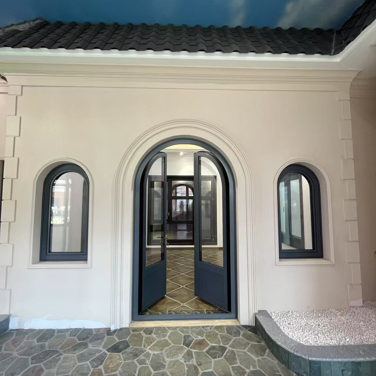
Black and charcoal front doors create a sophisticated, modern appearance and pair well with white siding, brick, and stone. Their timeless appeal can attract buyers, but darker finishes absorb more heat and may require additional UV protection.

Red front doors symbolize warmth, energy, and hospitality. They complement Colonial, farmhouse, and traditional homes, creating a strong focal point. Choose UV-resistant exterior paint to help minimize fading, especially on sun-exposed entrances.

Blue front doors communicate calmness, stability, and elegance. Navy works beautifully with brick and neutral exteriors, while lighter blues suit coastal and cottage homes. Blue provides versatile curb appeal without overwhelming the facade.

Green front doors create a natural, welcoming appearance. Forest green complements stone and traditional homes, while sage and olive shades suit Craftsman and cottage designs. Choose a tone that coordinates with surrounding landscaping and exterior materials.

Yellow and orange front doors add warmth, personality, and visual contrast. These bold shades work particularly well with contemporary and Mid-Century Modern homes. However, their distinctive appearance may appeal to a narrower range of potential buyers.

White, beige, and gray front doors offer a clean, versatile appearance that complements many architectural styles. Light colors reflect more sunlight and suit warmer climates, although white finishes may require more frequent cleaning to maintain their appearance.

Natural wood front doors highlight authentic grain patterns and bring warmth to Craftsman, rustic, and contemporary homes. Oak, walnut, and mahogany finishes create timeless appeal but require periodic sealing or refinishing to protect against moisture and UV damage.
Door Color | Best Architectural Style | Overall Impression |
|---|---|---|
Black / Charcoal | Modern, Colonial | Elegant and sophisticated |
Red | Traditional, Farmhouse | Bold and welcoming |
Blue | Coastal, Cottage, Classic | Calm and timeless |
Green | Craftsman, Tudor | Natural and harmonious |
Yellow / Orange | Contemporary, Mid-Century | Bright and expressive |
White / Neutral | Modern Farmhouse, Minimalist | Clean and versatile |
Natural Wood | Rustic, Craftsman | Warm and authentic |
Key Takeaway: For broad buyer appeal, consider black, navy, neutral shades, or natural wood finishes that complement the home. For a more personalized entrance, green, red, yellow, or orange can create a distinctive focal point. Always balance aesthetics with material compatibility and long-term maintenance.
Color Category | Psychological Signal | Best Architectural Fit | Maintenance Level |
|---|---|---|---|
Black / Charcoal | Authority, Elegance | Modern, Transitional, Colonial | High (Heat absorption risks) |
Red | Energy, Welcome | Traditional, Farmhouse | High (UV fading risks) |
Navy Blue | Trust, Stability | Coastal, Brick Exteriors | Medium |
Green | Harmony, Growth | Craftsman, Tudor | Low to Medium |
White / Neutrals | Purity, Cleanliness | Modern Farmhouse, Dark Siding | High (Shows dirt easily) |
Natural Wood | Craftsmanship, Warmth | Rustic, Contemporary, Craftsman | Very High (Annual sealing) |
In traditional Feng Shui, front door colors are associated with compass directions and the five elements. Choosing a color that corresponds to your entrance direction can create a sense of balance while complementing your home's exterior.
Door Direction | Feng Shui Element | Recommended Colors | Traditional Symbolism |
|---|---|---|---|
North | Water | Blue, Black, White | Career, calmness |
South | Fire | Red, Orange, Green | Recognition, prosperity |
East | Wood | Green, Brown, Natural Wood | Health, family |
West | Metal | White, Gray, Metallic | Creativity, harmony |
Design Tip: Consider sunlight exposure when choosing door colors. South-facing doors may require UV-resistant finishes, while darker north-facing entrances can benefit from additional lighting.
The best front door color should complement your home's exterior materials, architectural style, hardware, and lighting conditions.
Choose door colors that balance the undertones of your exterior materials. Navy blue or forest green complements warm red brick, while natural wood or burgundy adds warmth to cool gray stone.
Create a cohesive color scheme using siding, trim, and door colors. Neutral exteriors pair well with bold accent doors, while colorful siding often benefits from simpler door finishes.
Match the undertones of your front door with the roof. Charcoal and gray roofs complement cooler shades, while brown or terracotta roofs pair naturally with warmer colors and wood finishes.
Choose hardware finishes that complement the door color. Brass pairs well with navy and green, matte black suits white and natural wood, and brushed nickel complements cool grays and blues.
Lighting affects how door colors appear throughout the day. Warm lighting creates a softer appearance, while cooler lighting emphasizes crisp tones. Test paint samples in both daylight and evening conditions before making a final decision.
Key Takeaway: Choose a front door color that balances personal style, traditional Feng Shui preferences, exterior materials, and lighting conditions. A coordinated design improves curb appeal and creates a welcoming entrance.
Door Color | Recommended Hardware Finish | Recommended Lighting (Kelvin) |
|---|---|---|
Navy Blue | Unlacquered Brass, Satin Brass | 3000K - 3500K |
Black / Charcoal | Brushed Nickel, Polished Chrome | 3000K - 4000K |
Red | Matte Black, Aged Bronze | 2700K - 3000K |
Natural Wood | Matte Black, Oil-Rubbed Bronze | 2700K - 3000K |
White | Matte Black, Polished Brass | 3000K - 3500K |
A: Black and deep charcoal consistently add the most perceived value to a home. Real estate data frequently shows that homes with black or dark gray entryways sell for higher premiums. These high-contrast neutrals convey modernization, sophistication, and excellent upkeep, appealing to the broadest range of potential buyers.
A: In real estate, a red entryway signifies a welcoming, traditional home. It draws the eye directly to the entrance, creating strong curb appeal for classic architectural styles like Colonials and farmhouses. Historically, it indicated a safe haven for travelers, and today it suggests a vibrant, well-maintained property.
A: It should generally match neither. The entryway serves as a focal point and should stand out. While it can share undertones with the siding or trim to maintain harmony, using an accent color creates necessary visual contrast. Matching the siding makes the entrance disappear, while matching the trim looks overly uniform.
A: Yes, dark colors fade faster because they absorb more ultraviolet radiation and heat from sunlight. This breaks down the chemical bonds in the pigment. Reds, blacks, and dark blues require premium UV-resistant paints and clear topcoats to maintain their depth, especially on south or west-facing exposures.
A: Cool colors like navy blue, sage green, or deep charcoal are best for red brick houses. These colors sit opposite red on the color wheel, providing a balanced, complementary contrast that tones down the warmth of the brick. Classic black or crisp white also provides excellent, traditional contrast.
A: Yes, black paint absorbs maximum solar heat. On unshaded, sun-facing entryways, surface temperatures can exceed 150°F. This thermal load can warp wood, melt weatherstripping, and cause fiberglass or steel to bow. Always check the manufacturer's warranty regarding Light Reflectance Value limits before applying dark paint.


